Thursday, December 17, 2015

The funky letter

Sometimes letters on hockey jerseys are doing something. They are a part of the action. It's hard to explain so I'll just show you.


Minnesota NORTH STARS. And the star is ya know pointing up? It's pretty clever you know it is. The team then moved to Dallas and it didn't quite work the same


Calgary Flames jersey

Calgary Flames. The flaming C is just one of many fire themed things that go on with the team. When they score a light turns the entire ice surface red. It's awesome and intimidating for the opponents. Sweet stuff from them


The Hartford Whalers had a "W" that was also a whale. It's part cute and comical but back then it wasn't exactly the goal. Pretty neat though. RIP to this team though, they've been out of the league for a while now.

Going to school!

College hockey is a big deal believe it or not.
Check out some of the best NCAA uniforms from a sport that's quietly rising in the college ranks.


The University of Minnesota Golden Gophers maroon and gold is a big deal in college hockey. In the state with the most registered hockey players in the USA college hockey is just the next step. The team is a powerhouse, that's for sure but the sweaters also don't take a backseat to anyone. Just don't dare calling that "M" Michigan.


University of North Dakota had one of the best sweaters in college hockey. That is until they were forced to change their logo or a native american (a needed change). The uniform did look good though that's something no one can deny. Now these sweaters with the native on them are a collectors idea. And a beautiful one at that.


Boston College's eagle looks pretty majestic. There's a lot of colleges and a lot of college hockey in the city of Boston but this one takes the cake. The colors compliment well but it's the flying eagle that really looks nice. They might not have the best team in town but the uniform is top of the game.

Tuesday, December 15, 2015

National team jersey spotlight

The jerseys that countries wear in competitions like the Winter Olympics hold a lot of nationalistic pride. Sometimes they also look really nice as well. Here's jerseys that look awesome while bearing the weight of a nation.


Sweden: The three Kings jersey is always a great site to behold. It hasn't changed much over the years and the number of world class players who have worn it is extraordinary. Lots of medals have been won wearing it and if there was a medal based solely on looks it would probably win that one too.


Finland: Staying in Scandinavia we move to Finland who's blue jerseys with the shield make the Fins looks like ice medieval warriors or something. They often play second fiddle to their neighbors Sweden on the ice but their jerseys really are second to no one. The different shades of blue complement really well.


Canada: The best team in international hockey have always had a sleek look to their jerseys. There will always be red and a maple leaf. This 2010 version includes a player skating with the puck inside of it. It's pretty rad if you ask me. Lots of wins behind it also add to the value of this national team jersey.


Monday, December 14, 2015

The classics

Professional hockey is 100 years old. Over those years some teams have lasted the entire time, like the Montreal Canadiens while others time was short lived like the Hartford Whalers. 

Let's take a look at logos on sweaters that are still in use that remind use that sometimes no change is a great thing. These jerseys have stood the test of time. 


Montreal 
In the early days (1910-13) Montreal's jerseys did undergo some tweaks and changes. But from 1913 to today, 102 days later the iconic "C" on the chest has been the symbol of hockey's winningest franchise. 


Boston


The Bruins are not nearly as old as the Montreal Canadiens, but in 1948 they settled upon the "B" that has stood for Boston hockey for decades. The colors have never deviated from yellow and black and Boston has had an image they can stand behind just as long.


Detroit


On the top is the Red Wings jersey from 1932 and the bottom is today's uniform. Not much has changed with the jersey design. Red, white and a winged wheel on the chest has been a staple of Detroit spots. The winged wheels pays homage to the city's strong auto manufacturing history.


Sunday, December 13, 2015

The throwback sweater

Most sports fans are fans of the history of the sport, or their favorite team. That's why when teams show love for their heritage it's awesome for fans and players alike.

Here's some sweet looking throwback uniforms.


Detroit. Before the winged wheel there was just red and white stripes. It looks minimalist but it actually does work well because you know who the team is even if it didn't say the city's name across the chest. If Detroit were to wear these once every two years or so it would really be special for them.


Detroit Red Wings


Boston. Back in my classics post I spoke on Boston's iconic B. In this throw back the minor detail that changes is the style of the font of the B. This throwback is the very original design that has since been tweaked. It would take a true Bruins fan to notice but it's a fantastic touch that can't be ignored.

Boston Bruins


San Jose has only been around for 25 years now. But it feels like they've already been through about 10 different uniform designs. The teal and the shark always look good no matter the design but for their 25th year anniversary they went back to the very original jersey. It looks beautiful and many hockey fans agree that this is one of the nicest color/logo combo hockey ever saw.


Sunday, November 29, 2015

Colorful failures

This is the sister post to colorful successes  and I'd like to apologize in advance for the offense to your eyes.

too many colors or just colors that didn't quite work, here they are:


New York Islanders 1995-97. Ask any NHL fan anywhere what the worst hockey jersey of all time and this Islanders getup is usually a common response. Ask an actual Islanders fan about it and they probably won't want to continue the conversation. I mean maybe the intentions were good but this thing honestly looks like the official uniform of Woodstock, or an acid trip (well what's the difference there)


Vancouver Canucks 2001-2003. In their 40 year history Vancouver has experimented a ton with their uniform combination and colors. In some reason in the early 2000s they decided they needed to add blue to their logo. And in that bottom jersey they also decided apparently that they also needed a red tint thrown in there? I'm not sure what's going on, and to be honest I don't exactly hate it but if it only lasted two years it must have been a failure up in B.C.


I'm not picking on you Vancouver, I'm really not. But this 1978 uniform almost begs to be ridiculed. They ditched their green and blue for yellow and red and orange. It's a mess in every sense, especially the yellow jersey because it's so bright and then the huge "V" just sits there. It took almost 10 years to completely drop the "V" but the color scheme remained there for way too long.


Saturday, November 28, 2015

Colorful successes

Sweaters usually have a dominant color. Sometimes uniforms use different colors for the style. It's really a hit and miss process to go away from a solid color. Here's some successful ones:


Ottawa home, circa 2000s. This modern uniform is similar to older jerseys that tried to pull of stripes. The size of the senators stripes are probably what keeps them looking slick.


New York Americans (1932). This sweater was pretty patriotic for a league dominated by Canadians at the time. The red, white and blue almost looks like it could be our military uniform in cold weather if it weren't for the whole camo thing they're trying. All jokes aside the stars and stripes do actually look pretty good here.


Phoenix Coyotes. 1996-2003
Nothing say 1990s like these Coyotes sweaters. There are lots of colors going on, many of them unconventional. The retro looking Coyote holding a hockey stick really takes me back to the days I first became interested in hockey. The coyotes have since toned down the attitude in their sweaters but personally these babies could have stuck around forever.

Sunday, November 8, 2015

Best specialty jerseys

So we'll take a trip into the minors for this one. The professional hockey league doesn't go too wild with special jerseys used in games but the lesser leagues usually have some clever ones. Here's some of the best:


The Tulsa Oilers became the Gotham City Crusaders for Hero's night. The jerseys, pictured on the right give players a six-pack and the batman logo. This is awesome for superhero fans and even if you aren't the jerseys don't look tacky in anyway. Really great design


\

The Quad City Mallards out of the now defunct Central Hockey League wore these western sheriff jerseys on Police Appreciation night. These are extremely clever and they did a really good job. I'm not sure if exactly replicates Quad City PD's current uniforms but it really is a sweet touch.


Now this one is gold, literally. On golden ice night, the Kalamazoo Wings of the ECHL  teamed up with no other than McDonald's for a special promotional night. At first I thought wow that's some marketing stunt but it looks like proceeds went to a Ronald McDonald House, for kids with special needs. The ice was also painted yellow, hence the "Golden Ice" name. They actually look really cool if you get over how hilarious it is. That's not something you see every day in sports.

Friday, October 23, 2015

The tough guy post. (gruesome warning)

Hockey is a tough sport. You hear it all the time, mostly because it's true.


This post is about jerseys that get roughed up, or bloodied up and creates quite the scene.


This is Aaron Voros following a fist fight. He suffered a broken orbital bone. I bet if you ask him about it his response would be "you should see the other guy"


This is one of my favorite images of a hockey player. This is Montreal's Jacques Plante in the 1959-60 season. Goalie masks were primitive back then, they were newly introduced. While they were a step up from no masks at all, but as you can tell he got hit in the face and the blood still seeps onto that historic Canadiens logo.


I'm a big hockey fan and nothing upsets me more than a non-fan talking about they looovveeee hockey because of the fights. Fights are rare, they happen as a way to police the game or settle a disagreement. That's not to say I don't enjoy watching fights from time to time. And nothing is more common in the hockey fight than the jersey grab. Here is one between Toronto’s Colton Orr and Pittsburgh’s Deryk Engelland on Jan. 23.

Monday, October 19, 2015

Back in Black

Black is a color that only a few teams where on a regular basis. Some teams where black as their third jerseys, as I hit upon in my last post.

Here's my three favorite black jerseys of all time. It's a little risky because it doesn't always look great, but these sure do.


3. This is a Dallas Star jersey that they wore in the late 90s-early 00s. While it's a little confusing what it is this is constellations that form a bull. It's a pretty cool touch considering the Dallas Stars are Texas's only NHL hockey team. The constellations are pretty sweet too, cause ya know...stars.

Dallas has experimented with black jerseys after this one but none of them were as appealing to the eyes are this one.


2. San Jose's 3rd jerseys are some of the coolest around. While their regular teal is already a fan favorite this black jersey gives the sharks a sleeker look. The black jersey is complimented with teal in the arms and chest crest. The full body shark as opposed to the shark head that is normally on the jerseys is also a great touch.


1. The best black jerseys of all time are none other than the Kings jerseys that they wore in the Wayne Gretzky era. This sweater represented one of the first times that a black jersey was used as a primary jersey (back then dark was the away color). It also helps that Gretzky set some of hockey's more prestigious records while wearing this jersey. I will never be a Kings fan but it's hard to deny how swear these jerseys were.


Thursday, October 15, 2015

Third Jerseys

Every team in the league has a home jersey and a road jersey. In the NHL the home jersey is colorful, often dark and the road is white. This is part of the rule to avoid the away team and home team wearing clashing colors that confuse the crowd.

Another option for the home team however is the third jersey. These are special uniforms that they can wear on occasion to change it up. Sometimes they work out great, other times....we can't wait for the team to retire them permanently.


Here's an example of a pretty nice one, the NY Rangers third jersey that included lady liberty above the team's initials a great symbol of the city that they play in.


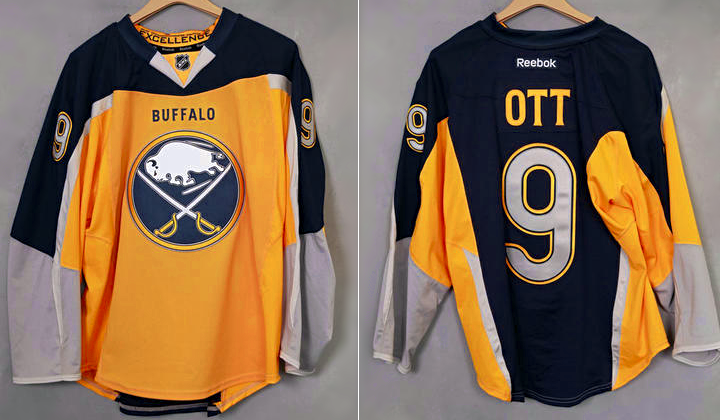
and here on the flip side is the Buffalo Sabres...not so great look


The yellow on the front is offensive enough, too bright. But instead of leaving it at that the uniform decided to also transition to blue on the back of the sweaters. Fans were vocal about not liking this specific jersey and it didn't see much action after the 2014-2015 season.

Monday, September 7, 2015

In hockey we call them sweaters

 (Jamie Benn - Dallas Stars, 2015)

I guess if you were to call it a jersey you would also be correct. But to get to with the lingo it's called a sweater. And the other 21 guys on your team all are united with this attire.

Your jersey and team is what you fight to win for. It's all part of the romance of the beautiful game on ice.

Sometimes the uniforms teams wear are sweaters that stand the test of time and will be remembered for the brilliance, their flash, their ability to united a team and bring an arena to it's feet. Some will be remembered for just how classic and historic their are to the landscape of hockey.

This blog will talk about those sweaters, why we remember certain hockey jerseys and why they are the coolest uniform in sports.


I'll leave you with this clip on why the name on the jersey is always secondary.